Make it faster, make it efficient
The client is a financial brokerage specialising in currency exchange and transaction management. Their back office handles large volumes of sensitive financial data, requiring accurate, secure, and scalable processes to support daily operations and compliance.
My Role
I acted as the UX lead, responsible for guiding the design direction and making key design decisions. I worked closely with UX designers to develop wireframes and prototypes, collaborated with analysts to ensure business requirements were met, and coordinated with developers and testers to make sure the solution was feasible and functional. We held regular meetings to review progress and gather feedback, ensuring alignment across the team.
Challenge
The client, a financial broker, wanted to build a more intuitive transfer, payment, and money management system for their back-office operations. The goal was to improve employee productivity with a clear and easy-to-use system, while preventing loss of information and enabling process tracking.
Immersion
We started by defining a clear target statement to ensure all stakeholders shared the same vision for the new product. This phase included reviewing the current system and identifying its flaws from both business and user perspectives. This helped us understand the client’s operations in detail and highlighted the need for a centralised, automated solution.
Challenges Faced
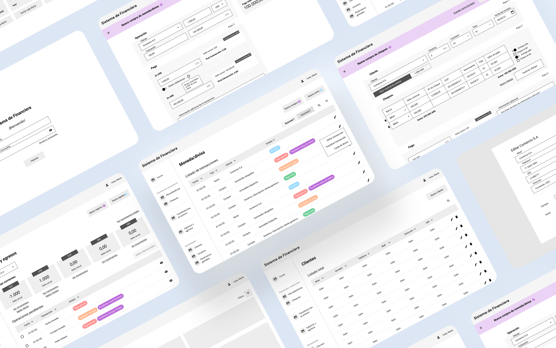
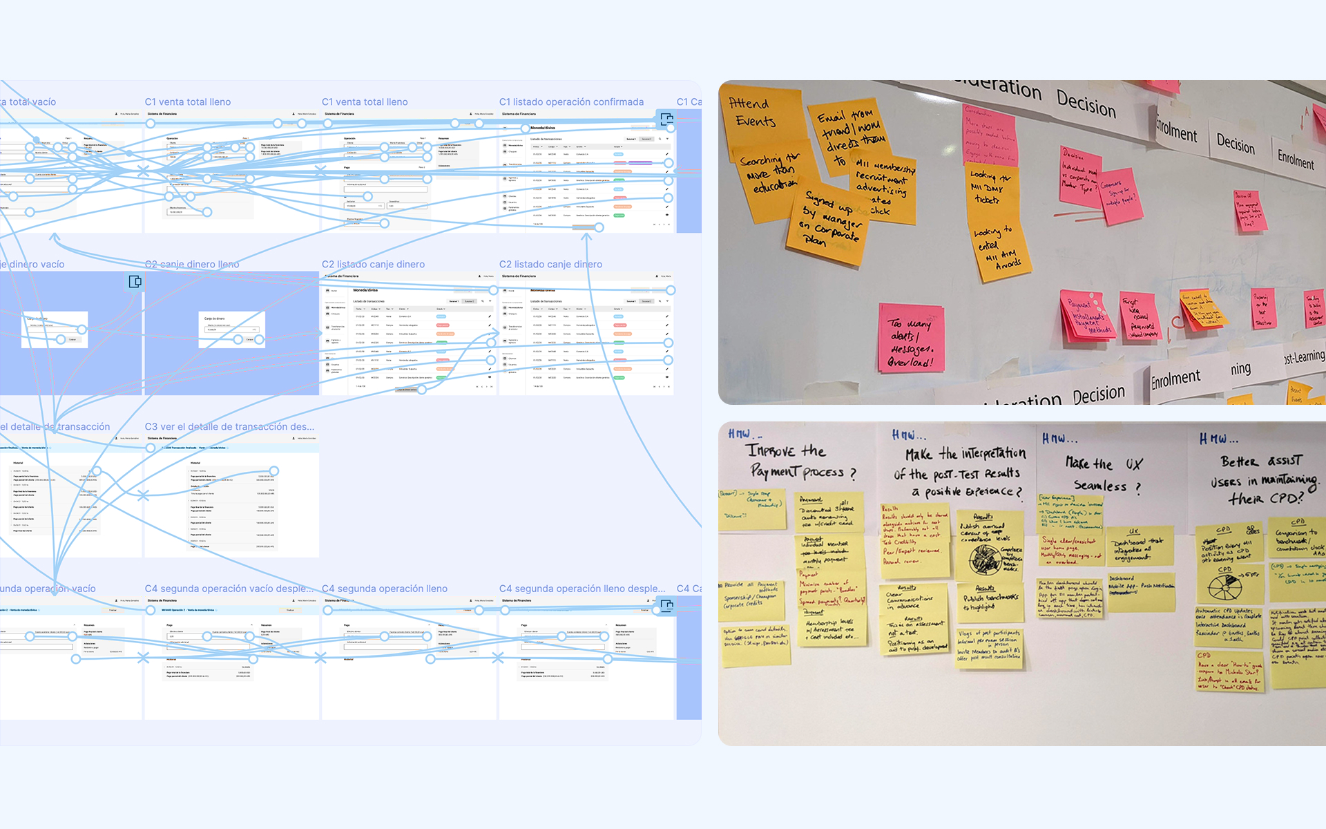
One challenge was balancing the need for a detailed data view with keeping the interface simple and intuitive. Early on, we considered a complex, multi-tab system to separate functions, but user testing showed it was confusing and slowed down workflows. We discarded that idea in favour of a single dashboard with clear sections, which improved usability and efficiency.
User Research
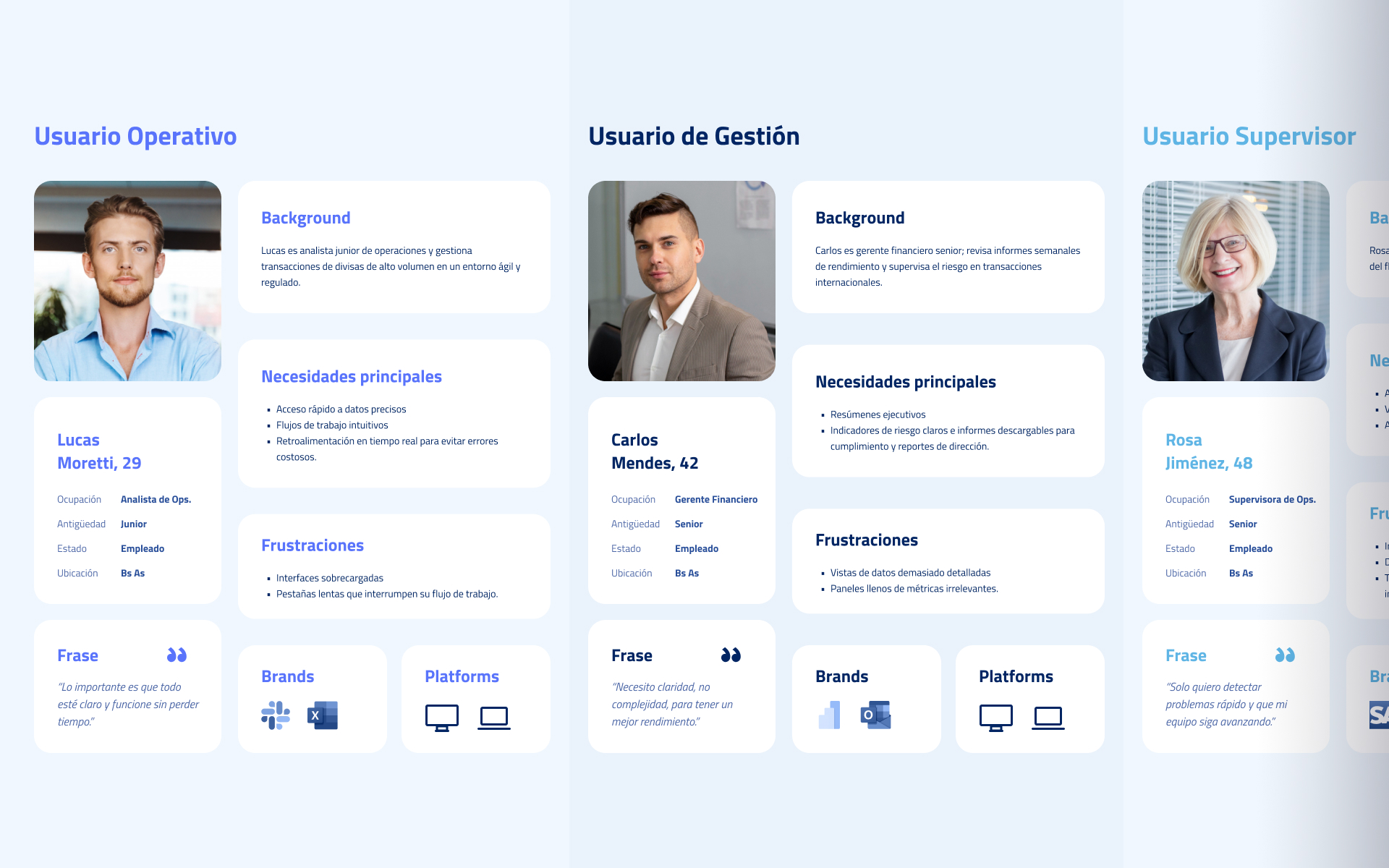
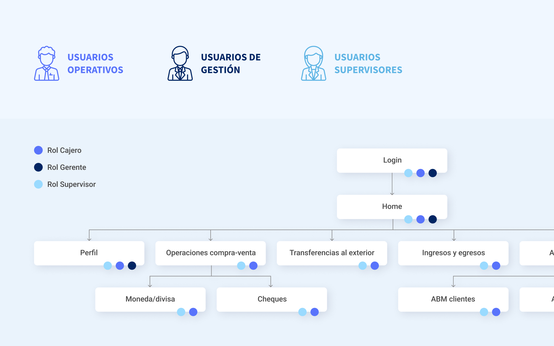
We conducted user research to validate assumptions and understand real employee needs. We found that some of the client’s assumptions did not fully match user realities. We created three user personas representing different roles, Management, Supervisors, and Operative users, and defined access levels based on their responsibilities. This helped us map user journeys and identify specific pain points and workflows.
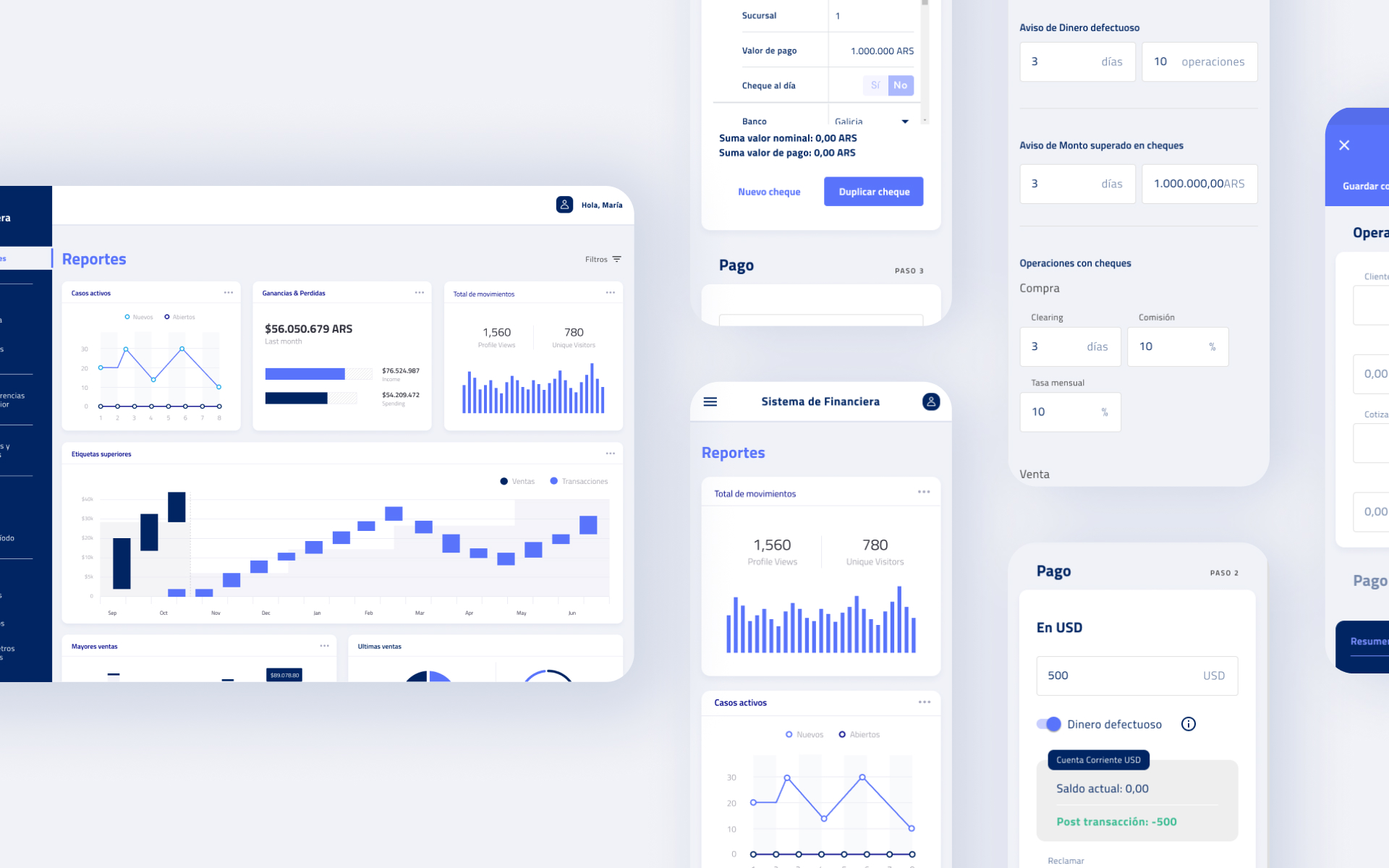
User Experience
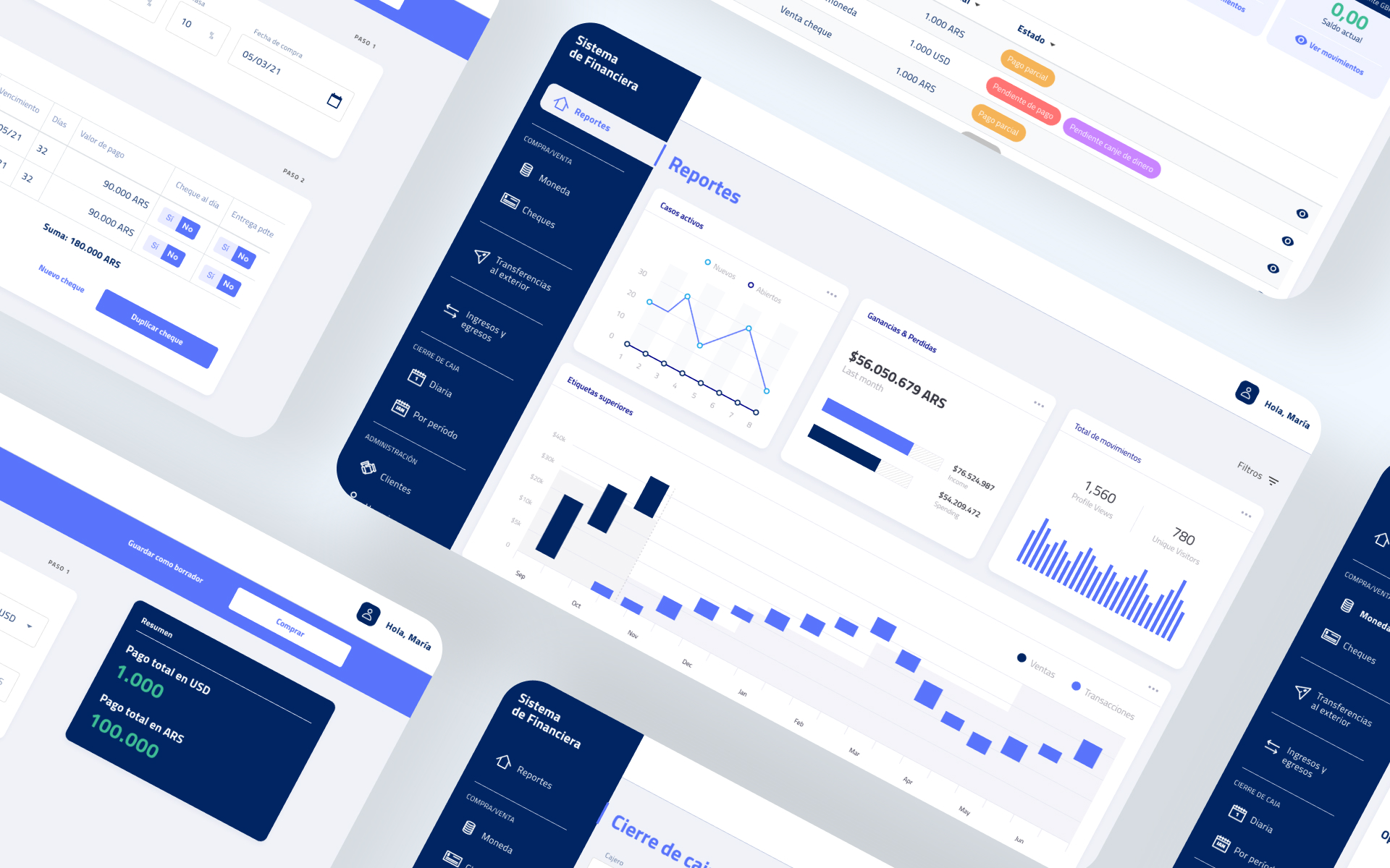
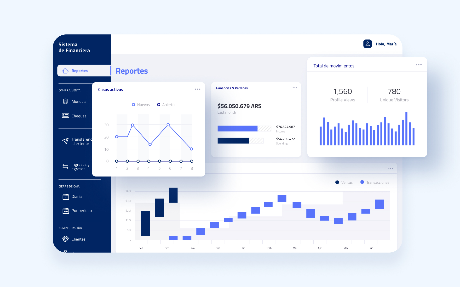
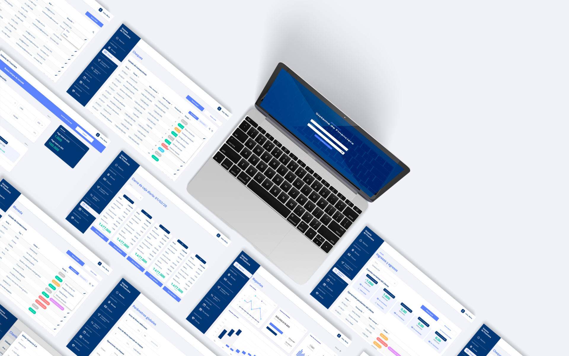
Using insights from research and strategy, we developed multiple wireframe versions of the dashboard to find the best solution. We focused on how employees would manage large amounts of data efficiently. Over five days, we tested the design with four users and gathered valuable feedback to improve usability and clarity. The system supports daily cash operations, transaction tracking, and automated calculations.
Visual Design
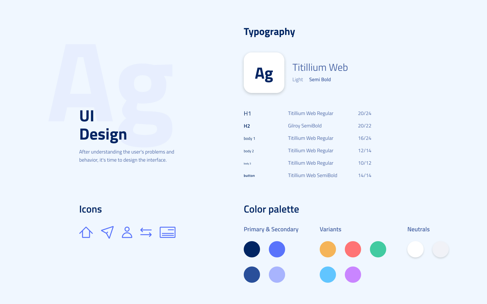
The design moved away from dull, grey tables to a clean, flat dashboard dominated by calming blue tones. This colour choice creates a sense of calm and modernity, making the interface more appealing and easier to navigate for banking staff.
Impact Created
The digital transformation significantly increased back-office service speed, employee productivity, and customer satisfaction. The learning curve for new employees dropped from several weeks to just a few days. Automation and centralised information eliminated manual errors and improved scalability, allowing the broker to handle growing transaction volumes efficiently.
Lessons learned
I acted as the UX lead, responsible for guiding the design direction and making key design decisions. I worked closely with UX designers to develop wireframes and prototypes, collaborated with analysts to ensure business requirements were met, and coordinated with developers and testers to make sure the solution was feasible and functional. We held regular meetings to review progress and gather feedback, ensuring alignment across the team.